Building a Responsive Design is Hard – Responsizer.JS Makes Testing Easier
A Responsive Design Debugging Tool
Building a responsive web design is hard and I’ve built a tool to help testing handheld sizes on the laptop easier
I choose to build my latest web site (www.MadeFreshCoffee.com) in a totally responsive manner working comfortably on laptops, iPads, iPhones in portrait and landscape. You know the familiar Siren’s song of write-once and target-many that only serves to dash our dreams on jagged open-source rocks.
Of course you’re doing the exact same thing as me and you know that testing the media query rules powering a responsive design is a grind. In fact it’s insane.
How do we test CSS selector rules we craft? Send a fist full of files up to the server and load on all the devices? Are all the devices at hand? Is the server ready? Is the server production only and off-limits to R&D experiments?
Instead keep your development local and simply drop in the Responsizer.JS library I wrote. It shows the laptop browser width and height as you resize while highlighting the common device widths. Does it really work? Of course. This library is so easy and useful you’ll wonder why you haven’t had something like it already.
Screencast Demo
All of us visual learners will enjoy this short video I recorded showing the library in action:
How to Use Responsizer
Grab the files from my GitHub repro here:
https://github.com/KDawg/Responsizer.js
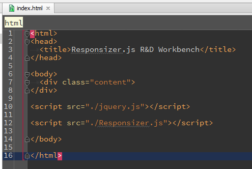
Include the file “Responsizer.Js” into your index.html:
Notice jQuery is a requirement and must be loaded and available before bringing in Responsizer.
What is It?
The library is in fact a simple piece of JavaScript code. It’s a self-invoking function that hooks onto the window’s “resize” event. At the same time it creates a display box centered along the top of the window. Watch it tell the window’s width and height as the browser reports it. Then see your responsive design confirming the media query rules match the form-factor breaking-points.
As you resize your laptop browser (Chrome, Firefox, Safari, etc.) you’ll see the library reporting the width and height. When a typical mobile width is reached (1024, 768, 568, 480, 320) it changes colors highlighting the significant breaking-point. This guidance helps you conveniently test your responsive design on your development laptop without dragging a cellphone or tablet or public server into the mix.
Use Responsizer.Js to Learn from Other Websites
Something cool can happen if we reach a little farther. Hook Respsonsizer.JS into your favorite public website while browsing it on your laptop.
- In Google Chrome load up a favorite, well-known website. For example these stand out to me: www.smashingmagazine.com, www.microsoft.com, www.css-tricks.com
- Open up the Developer Console
- Assure you have a local webserver running (for example Apache) and that the Responsizer.JS is in its document root and can be served up from localhost
- In the Google Chrome developer tools console type this to attach Responsizer.JS to the currently loaded webpage:
$('body').append('<script type="text/javascript" src="http://localhost/Responsizer.js/Responsizer.js"></script>')
Now you can plainly learn where your favorite web-site authors decided to handle breaking-points and how the design changes.
Here’s What I see
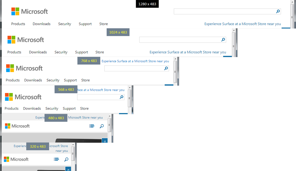
Here’s a simple example of what I see the Microsoft site doing as I resize it. This illustration doesn’t show off their most powerful design work, but it gives an example to inspire your own investigation. Go check it out for yourself. It’s good stuff!
ResponsizerJS is killer right? Absolutely safe and sane and doesn’t hurt a thing on your machine or their site. The affects disappear as soon as you tap “reload”. It’s fantastic what we can do with web development. I am loving it!
Go Use This
I expect this will help you just as it helped me. Give it a go and play around with it. Adapt it if you like. Change the highlight colors, tweak the default colors, raise up the z-index, add more target form-factor widths.
Whatever you do have a serious try making Responsizer.JS a useful addition to your webapp development workbench. Have a coffee, and finish up that web site!


